SUMMARY
This is AI generated summarization, which may have errors. For context, always refer to the full article.

MANILA, Philippines – With its declining legacy businesses, PLDT Incorporated, formerly called Philippine Long Distance Telephone Company, has evolved with strategic rebranding, reflecting its 3-year massive digital transformation.
During a surprise launch late Monday, June 13, PLDT and its subsidiary, Smart Communications, Incorporated, launched their new logos and change in name to better represent their current thrust to shift the business to data-driven services. (LIVE: It’s A New Day for PLDT-Smart)
“Rather than allow ourselves to be disrupted by new technologies, we are disrupting ourselves. We have embarked on a digital pivot to enable us to serve the increasing needs of our people’s digital lifestyle and the country’s growing digital economy,” PLDT Chairman Manuel V. Pangilinan said during the launch.
The country’s largest phone carrier has embarked on a 3-year digital pivot that aims to transform its networks into a top data-capable infrastructure. (READ: PH telcos, TV networks ride double-edged digital wave)
PLDT set a capital spending budget of P43 billion for this year, mainly to fund the acquisition of the telecoms business of San Miguel Corporation, which included the utilization of the so-called digital dividend, the 700 megahertz (MHz).
Not just a telco player
“We can tell that the company is really committed to providing new offerings that could cater to new businesses that leverage disruptive technologies, like Big Data, as their competitive advantage,” Alon Anthony Rejano, market analyst at International Data Corporation, said in a phone interview.
“We saw the company involved in acquisitions and partnerships with huge technology vendors, and it is a good sign that a telco like PLDT is gearing up its business toward a 3rd Platform player,” he added.
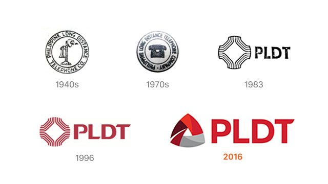
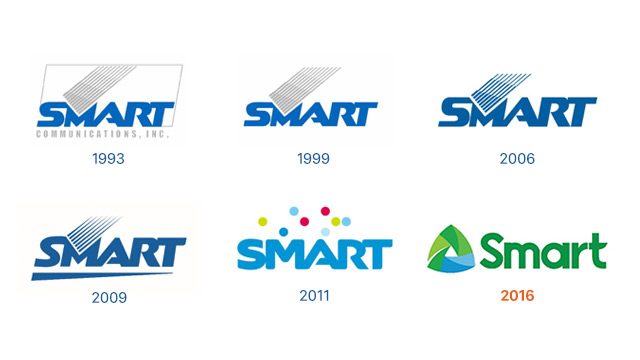
According to Pangilinan, the new logos symbolize “the powerful convergence of PLDT and Smart, combining fixed and wireless technologies to serve individual and enterprise customers.”


The new PLDT and Smart logos are shaped like triangles with the 3 sides representing the business pillars: People, innovations, and customers.
The triangle is also the symbol for Delta, the fourth letter in the Greek alphabet, which stands for “change.”
These new logos received criticisms from several social media users.
Nag-palit ng logo yung pldt pero yung sistema nila ganon pa rin.
— Alice Bacallo (@AlicetheB) June 13, 2016
PLDT-Smart, we don’t need a new logo we need a fast internet! #ANewDay
Dapat turtle ang logo ng PLDT MyDSL. Puñeta.
— Janaica Joson (@aikamaruu) October 31, 2015
But Pangilinan quickly responded to the criticisms, saying the change is just one of its many steps to digital transformation.
“It is a refresh of both logos and we got some criticism from the social media that the digital pivot is just more than the logos. I agree. That is why this is more than changing the name, logos,” the PLDT chairman said.
“Sure, it is just one element of the many needed steps to execute this digital strategy,” he added.
Following its incorporation in 1928, PLDT’s old corporate name reflected its traditional fixed line telecommunications business.
PLDT’s key performance indicators in 2015 reflected the challenges the company has been facing.
- Consolidated revenues stable at P171 billion
- Fixed-line revenues up by 2% to P65.6 billion
- Wireless business lower by 4% to P110.7 billion
- Capital spending budget at P43.2 billion – an all-time high
For Pangilinan, PLDT’s legacy businesses – international and domestic long distance voice services and text messaging – have been declining.
“With legacy revenues receding, our future clearly lies in data, broadband, and the growing universe of digital applications,” he added.
For IDC market analyst Rejano, the rebranding will have a minimal impact on subscribers.
“Although a company logo is an effective tool of branding association and marketing campaign, I think customers won’t cut their subscription just because they dislike the design. The quality of the offerings will still be the main basis of customers,” Rejano said. – Rappler.com
Add a comment
How does this make you feel?
There are no comments yet. Add your comment to start the conversation.