SUMMARY
This is AI generated summarization, which may have errors. For context, always refer to the full article.
MANILA, Philippines – With various multi-hazard maps available, some express confusion on which ones are official.
A similar sentiment was expressed during a forum on Thursday, October 8, organized by the Association of Pacific Rim Universities. Project NOAH Executive Director Mahar Lagmay clarified that “Project NOAH maps are the official maps to be used,” as cited in a 2014 joint memorandum circular.
The memorandum also provides information on how to use the multi-hazard maps in future reconstruction and rehabilitation efforts of disaster-hit areas, particularly the 171 municipalities affected by Typhoon Yolanda (Haiyan).
According to Lagmay, the maps are very detailed, up to 1:10,000 in ratio. The maps are shown in the NAMRIA Geoportal and the NOAH website. (READ: Project NOAH: Advocating a culture of safety)
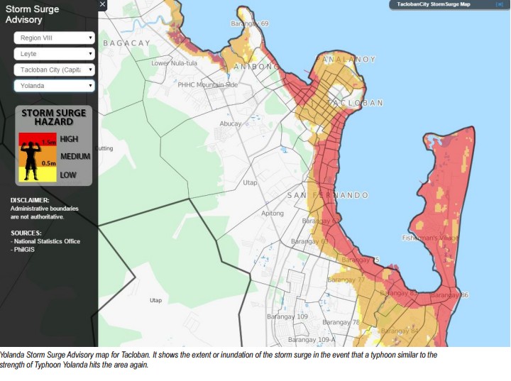
The map also identifies safe areas, which “people and the LGUs need to see,” Lagmay stressed. “These areas identify which places are safe for development.”
On the question of using other maps, Lagmay said that it can be used “if a more detailed work has been done and is more superior on a nationwide scale.” He emphasized, however, that such maps will need permits from the Mines and Geosciences Bureau (MGB).
Interpreting maps
Philippine Institute of Volcanology and Seismology Director Renato Solidum also raised the issue of interpreting maps.
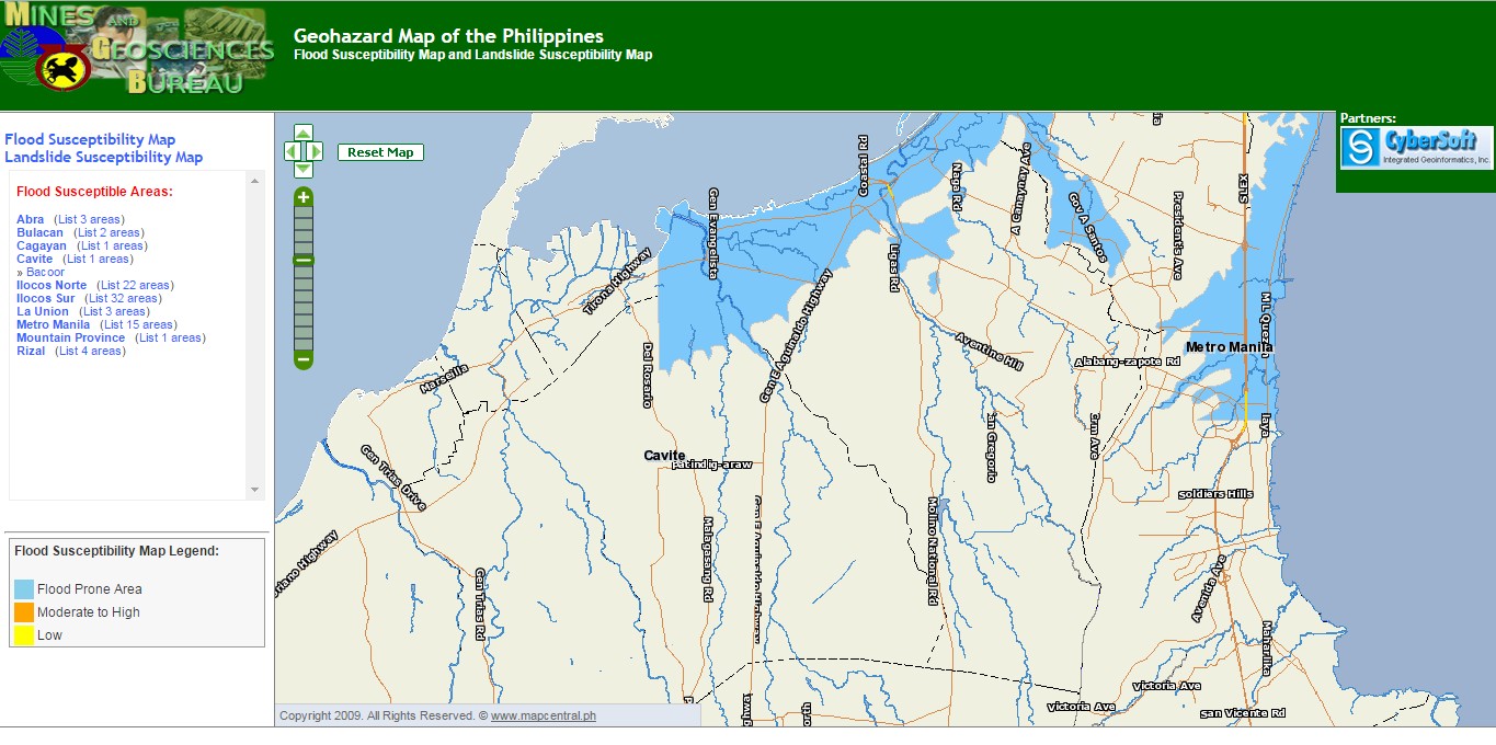
Solidum said that the MGB map is a “susceptibility map,” therefore lists the areas which are easily affected by hazards. The Project NOAH map, on the other hand, is a “scenario map,” showing what can happen given a hazard level.
“The issue here is at the local level, they cannot explain it that way,” he argued. “They say there is an issue but I think there should be no issue.”– Rappler.com
Add a comment
How does this make you feel?


There are no comments yet. Add your comment to start the conversation.