SUMMARY
This is AI generated summarization, which may have errors. For context, always refer to the full article.
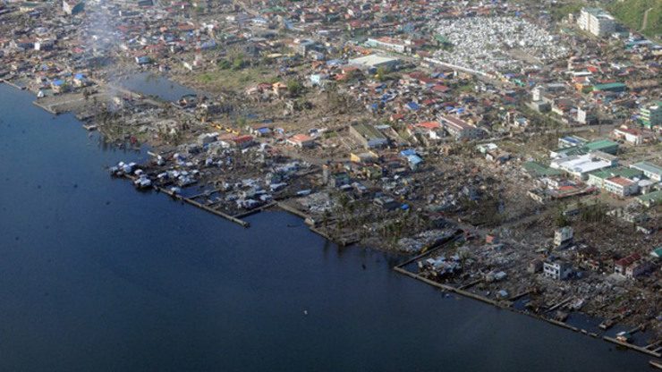
MANILA, Philippines – Typhoon Ruby (international name Hagupit) is expected to generate storm surges of 3 to 4 meters in Eastern Visayas when it makes landfall on Saturday, December 6.
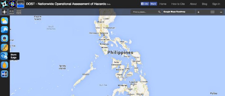
Ruby will be the first test for the government’s latest storm surge preparedness programs, which include storm surge simulation maps for coastal provinces and storm surge advisories. Both are available on Project NOAH, the website of government disaster preparedness agency .
The storm surge simulation maps identify the parts of your community which will be reached by a storm surge.
The maps are ready for 58 out of the 68 coastal provinces in the Philippines. They are available for all coastal provinces in the Yolanda corridor.
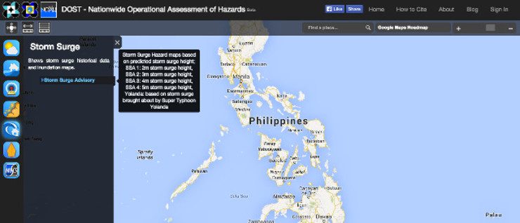
The maps should be used after Project NOAH releases its Storm Surge Advisory (SSA), which announces the predicted storm surge heights for specific localities. SSAs are issued two days before the storm makes landfall.
- Storm Surge Advisory 1: 2 meters
- Storm Surge Advisory 2: 3 meters
- Storm Surge Advisory 3: 4 meters
- Storm Surge Advisory 4: 5 meters
Once a Storm Surge Advisory is raised over your locality, you can search the Project NOAH website for the maps appropriate to the Storm Surge Advisory.
Anyone may access these maps for free by visiting the Project NOAH website.
Here’s how to get the maps for your province
1. When you visit the site, you will see a map of the Philippines on the front page. To the left is a column of icons. Click the storm surge icon (icon with a wave and house).
2. Click “Storm Surge Advisory.”
3. Choose the Region, Province, Municipality, and Storm Surge Advisory Number that Project NOAH has declared over your area.
4. Wait for the map to load. It may take a while depending on the speed of your Internet connection. If your locality will be affected by a storm surge, the map will show red, yellow, or orange spots.
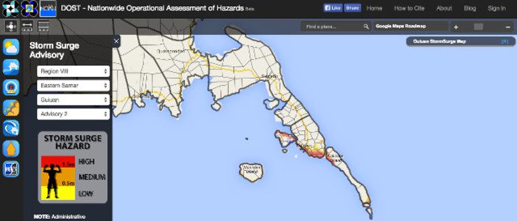
5. You can zoom in or zoom out of the map by clicking on the “+” or “–” in the upper right of the screen.
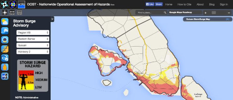
How to interpret the map
Different colors represent different heights of flooding caused by the storm surge.
Red stands for high storm surge hazard, which means 1.5-meter floods or floods that will reach or go beyond the head.
Orange means medium hazard or 0.5-meter flooding – water levels up to the thigh until the head.
Yellow means low hazard or knee-high floods.
If you are in a part of your locality that has none of the 3 colors, your area is deemed safe from storm surge.
The other icons on the front page allow you to do the same thing for other hazards, like flooding and landslides.
Want to know more about storm surges and the factors that determine its power to inflict damage? Read Rappler’s infographic here. – Rappler.com
Stay alert and ready with the latest weather and disaster information through Project Agos.
Add a comment
How does this make you feel?
There are no comments yet. Add your comment to start the conversation.