SUMMARY
This is AI generated summarization, which may have errors. For context, always refer to the full article.
MANILA, Philippines – Netizens have called out the Presidential Communications Operations Office again, this time for what they called a “misleading” infographic posted on the PCOO Facebook page on Thursday, November 3.
PCOO released an infographic series on the Duterte administration’s “#BuildBuildBuild” infrastructure program. One particular image drew netizens’ attention, as it compared the proposed infrastructure spending of the current administration with the actual infrastructure spending of its predecessors, starting from the Marcos regime.
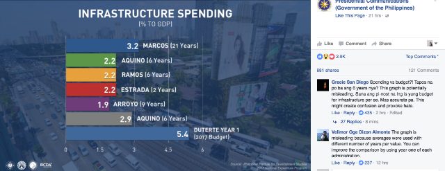
The infographic shows the actual infrastructure spending as a percentage of the gross domestic product (GDP) during the administrations of former presidents Ferdinand Marcos, Corazon Aquino, Fidel Ramos, Joseph Estrada, Gloria Macapagal-Arroyo, and Benigno Aquino III; and the planned infrastructure spending of President Rodrigo Duterte in 2017, his first full year in office.
The values assigned to each former president were averaged based on their number of years in office and their actual spending percentages.
Following the graph, Marcos spent on average 3.2% of GDP for infrastructure in his 21 years in office; Mrs Aquino and Ramos, both 2.2% of GDP during their 6- year terms; Estrada, 2.2% in his two-and-a-half years in office; Arroyo, 1.9% in her 9 years as president; and Aquino III, 2.9% during his watch.
Under the infographic, Duterte was assigned an infrastructure “spending” value of 5.4% of GDP – far higher than the funds spent by his predecessors on infrastructure – based only on the proposed infrastructure budget in the 2017 national budget that is still being deliberated in Congress.
‘Confusion’
Netizens were quick to note that the average infrastructure spending of past administrations, based on the actual amount spent, should not be compared to what the new administration has only proposed to spend next year.
“Spending vs budget?! Tapos na po ba ang 6 years nya? This graph is potentially misleading. Sana ang pi-nost na lang is ‘yung budget for infrastructure per se. Mas accurate pa. This might create confusion and provoke hate,” Gracie San Diego said in her comment on the PCOO post.
(Spending vs budget? Is his 6 years over? This graph is potentially misleading. They should have posted the budget for infrastructure per se. It’s more accurate. This might creative confusion and provoke hate.)
Netizen Velimor Oge Dizon Almonte suggested a better approach to presenting the figures. “The graph is misleading because averages were used with different number of years per value. You can improve the comparison by using year one of each administration,” Almonte said.
Kylie Misa also expressed her frustration over the post in the comments section. “This infographic is so misleading. Hahaha! Spending is different from budgetary allocations,” said Misa.
This was not the first time the PCOO received flak from netizens for its social media posts. In late August, it’s #WarOnDrugs charts also drew criticism.– Rappler.com
Add a comment
How does this make you feel?
There are no comments yet. Add your comment to start the conversation.