SUMMARY
This is AI generated summarization, which may have errors. For context, always refer to the full article.

MANILA, Philippines – Before a pandemic forced Filipinos to seek shelter in their homes, the country’s biggest and most iconic stars under media giant ABS-CBN lent their influence to campaign against the revocation of their networkd’s franchise.
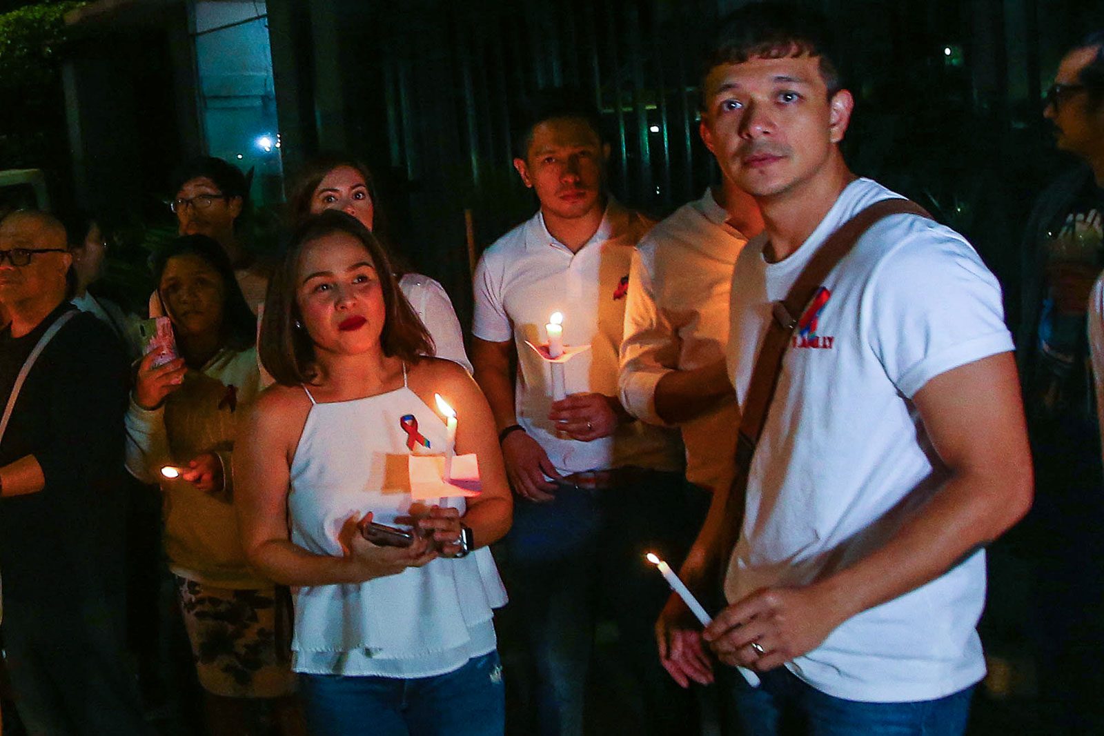
Star Magic, the talent agency of the media network, posted a series of portraits of its stars wearing white tops and the now-recognizable “RGB ribbon.”
The RGB (red, green, and blue) ribbon, stand for the colors of the network.
Thess Gubi, Star Magic’s head publicist, told Rappler in February that the campaign was a “Star Magic initiative and campaign to support the ABS-CBN franchise renewal.”
The photos had with them the hashtags #StarMagicStandsWithABS-CBN and #InTheServiceofTheFilipino. “In The Service of the Filipino,” is the company slogan of ABS-CBN.
Gubi said that it was the employees themselves who initiated the campaign. It’s unclear, however, who among the employees first thought of the ribbon.
Employees and and contract stars have showed their support for their network through Friday protests, Walks of Faith, and wearing the RGB pin. (READ: ‘Show of love for democracy’: Groups hold Red Friday protest to support ABS-CBN)

The book Kapitan: Geny Lopez and the Making of ABS-CBN, explains the significance of those colors: “The 3 circles symbolized both radio waves emanating from a transmitter as well as Luzon, Visayas, and Mindanao, while the 3 colors were patterned after the red, green, and blue of a TV screen. Above and below the logo were the initials ABS and CBN in stark stylized Malayan type. In 1968, the architect and interior designer Wili Fernandez retouched it, using a new customized font called ‘ABS-CBN Contemera.’ Otherwise the logo has remained the same.”
Before the red, green, and blue colors, the network’s logo was in black and white. The logo was tweaked along the way before it became the symbol that most Filipinos can easily recognize today.

– Alexa Villano/Rappler.com
Add a comment
How does this make you feel?
There are no comments yet. Add your comment to start the conversation.