SUMMARY
This is AI generated summarization, which may have errors. For context, always refer to the full article.
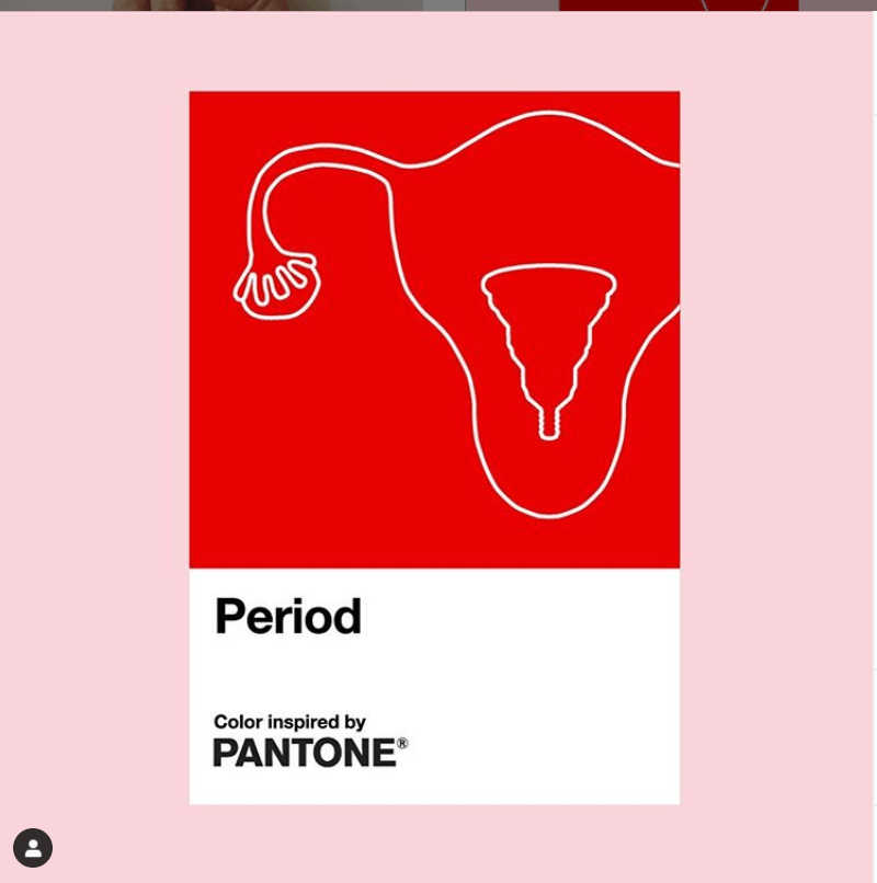
Pantone has introduced a new shade of red called “Period” to its roster of colors, created to “break the stigma around menstruation and promote period positivity.”
The color institute announced the new custom color via Instagram on Wednesday, September 30, in collaboration with Intimina, a Swedish healthcare company.
The move is in support of Intimina’s global campaign “to make menstruation more visible and normalize this most normal of bodily functions.”
According to Pantone, the “active and adventurous red hue” is meant to “embolden people who menstruate” to feel proud of who they are, to own their period with self-assurance, and to celebrate the “exciting and powerful life force” they are born with.
“[We want] to urge everyone regardless of gender to feel comfortable to talk spontaneously and openly about this pure and natural bodily function.”
The new color of Pantone and Intimina’s Seen + Heard campaign is inspired “by a steady menstrual flow,” but is in no means an accurate depiction of what a period must look like. – Rappler.com
Add a comment
How does this make you feel?
There are no comments yet. Add your comment to start the conversation.