SUMMARY
This is AI generated summarization, which may have errors. For context, always refer to the full article.
MANILA, Philippines – A new University of the Philippines (UP) logo for its University Athletics Association of the Philippines (UAAP) team recently surfaced online and netizens have been anything but pleased.
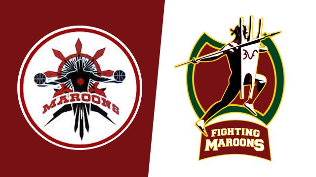
The logo, which went viral online on Tuesday, June 16, depicts a warrior holding a spear and shield with “UP” spelled in baybayin (old Tagalog alphabet) characters. It was initially reported to replace the old UP logo, which features the Oblation, a symbol easily associated with the state university.
However, the logo isn’t final yet. This is according to Dr Gonzalo Campoamor II of the UP Research Dissemination and Utilization Office, in report released by GMA News online.
“We’re still developing the logo,” Campoamor said, adding that UP plans to launch the new logo on a later date.
Netizens likened the logo to University of the East’s mandirigma (warrior) logo and to a certain brand of condiment.
According to netizens, the logo doesn’t clearly represent the state university.
On a thread in the University of the Philppines – Alumni Association Facebook group, Benedict Exconde commented that the “Oblation is the enduring and beloved symbol of everything and anything that is UP – academic excellence, athletic excellence, the UP spirit.”
According to Eliseo Rio Jr, the baybayin characters – which also appear on the UP sablay – read as “upa,” which he said was Tagalog for “hire” or “rent.” (“Upa” is Tagalog for “payment” or “fee.” – Editors)
“Are we advertising our graduates as ‘For Hire’? In Bisaya, ‘upa’ means ‘to have sex.’ Now, these symbols are in our UAAP logo. Is this UP?” Rio asked.
Ted Te, spokesman of the Supreme Court, also criticized the logo.
“There is a reason why there is an Oblation in every UP campus. And so many clenched fists too. That is the spirit behind the oblation: service and sacrifice; the giving of self. It is the same spirit that moves every UP student and alum to raise a fist or offer a hand and not see any contradiction,” Te said in his Facebook post.
Here are other online sentiments on the UP logo:
“UP is the Oblation and the Oblation is UP” yeps. And i do not even understand the logo.
— Beatrice Aban ✡ (@Beyuuuhh) June 18, 2015
I’m quite skeptical about the new UP logo for the UAAP.
— Patricia Aduana (@Pizzzabelle) June 17, 2015
I have nothing against the people behind this idea. I just want Oble back in the UP logo because the Oblation is UP! pic.twitter.com/SumxAVcfsx
— Rica Mae Mendoza (@mendoza_ricamae) June 17, 2015
Who made the new UP Maroons logo? Oh boy, terrible! We have a lot of homegrown artists that you could have commissioned! 1 like = 1 prayer
— Peter Paredes (@peteroscope) June 17, 2015
haha di ko alam kung nagbago ng team name ang UP MBT dahil sa logo change haha UE DATU PUTI’S!!!
— Lelouch vi Britannia (@themacmacshow) June 17, 2015
What if “Ikot jeep” ang logo natin? O sunflower? O di floral ang mga jersey ng Fighting Maroons ano po. #UPLogo
— Mikee Nazal (@mikeenazaltoday) June 17, 2015
– Rappler.com
Add a comment
How does this make you feel?
There are no comments yet. Add your comment to start the conversation.