SUMMARY
This is AI generated summarization, which may have errors. For context, always refer to the full article.
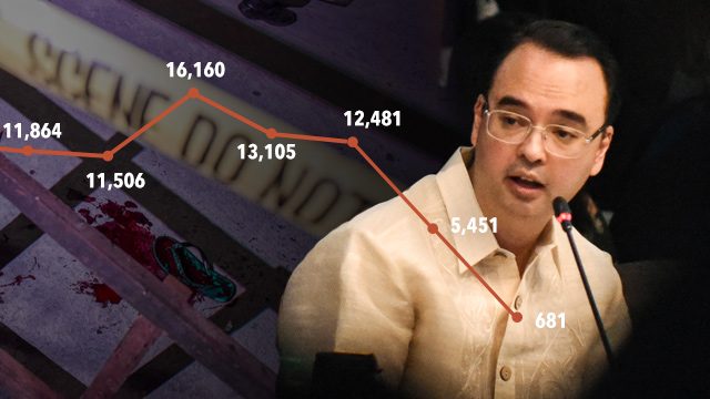
MANILA, Philippines – On the first day of the Senate probe into the alleged extra-judicial killings of alleged drug pushers, Senator Alan Peter Cayetano showed a line graph to support his case for the “war on drugs.”
The graph (shown below) indicated the number of reported murder and homicide cases in the country from 2010 to August 3, 2016.

It appears, based on the data, that the President’s war against drugs is, indeed, having a huge positive effect.
Cayetano said, “From 2010 to 2015, during the Aquino administration, an average of 35 ang patay araw-araw (are killed every day). Ngayon po, sa ilalim ni Presidente Duterte, 20 po. (Now, under President Duterte, only 20.) More than about a third, their lives are now being saved every day because of the efforts of the PNP [Philippine National Police].”
Observant netizens, however, immediately noticed something wrong with Cayetano’s graph: at first glance, it could be wrongly concluded that murders and homicides have dropped significantly in 2016 – from over 10,000 the previous year down to only hundreds up to August 3.
What’s wrong with Cayetano’s presentation?
Cayetano’s line graph implies a more drastic drop in 2016 than what his own figures actually show.
Data analysts say that a line graph – showing change in data over time – should cover similar time periods. Cayetano’s graph didn’t. The data he plotted for years 2010 to 2015 were all for full years.
His data for 2016, however, are still incomplete, covering only 216 days, and not 365 days as in the previous years.
It is also incorrect to have statistics for two markers for the year 2016 – the first marker covering January to June of 2016, and the second covering July 1 to August 3 also of the same year – and then compare them to one marker covering a full year.
Cayetano’s point
In a phone interview with Rappler Saturday, August 27, Cayetano said the point of his presentation was to show that in the first few weeks of the Duterte administration, the average number of murder and homicide cases is lower compared to the previous Aquino administration.
“Pinapalabas ng media na grabe ang patayan ngayon (the media is making it appear that the killings have gotten worse), but look at the lower average under Duterte,” Cayetano said.
“Take the graph along with my speech,” continued the senator. He also pointed out that the time periods for the 2016 data are clearly stated on the slide.
He added that his main point was “to know kung tama ba ang drug war o hindi (if the war on drugs has positive results or not).”
Cayetano conceded however that the average number of cases should have been the data plotted, instead of the raw number of cases, to correctly present his point. Yet the previous years have 365 days as basis of averages. The Duterte administration average covers only 34 days (July 1-August 3).
He emphasized there was no intent to mislead.
Data discrepancy
Cayetano’s data also appear to be inconsistent with the data contained in a similar graph that PNP chief Ronald dela Rosa presented during the second day of the Senate probe on Tuesday, August 23.
Dela Rosa’s line graph (see below) shows the number of cases of murder, homicide, and physical injuries logged by police from July 1 to August 18, 2016.
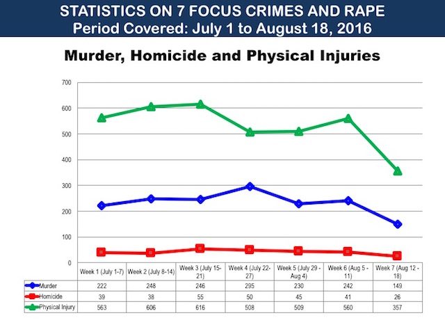
According to Dela Rosa’s data, from July 1 to August 4 – Duterte’s first 5 weeks as president – the PNP logged 1,241 murder cases and 227 homicide cases, for a total of 1,468 cases.
This is already more than double the 681 cases recorded from July 1 to August 3 that Cayetano cited in his graph – a clear discrepancy.
Cayetano’s 681 “murder and homicide cases” also seem to tally with the number of vigilante or extra-judicial killings from July 1 to August 3, based on police records cited by Senator Panfilo Lacson. Vigilante killings, however, do not distinguish between murder and homicide – murder carries the intent to kill and sometimes involves premeditation.
As for the seemingly conflicting figures for 2016, Cayetano maintained that he got the data from the PNP.
“PNP reported to us last August 3 that there were 681 murders and homicides since July 1,” Cayetano said, also adding that the figures excluded deaths as a result of police operations.
The 1,468 cases under the Duterte administration reflected in the PNP’s line graph “includes [deaths due to] legitimate police operations,” Cayetano said.
Suggestions
How can the senator improve the accuracy of his data visualization? Here are 4 suggestions:
1. Going by his intent to show the averages, Cayetano could plot the figures on the 3rd row in the table he provided in his slide.
While it may be okay to use his original data, it is still best to observe the “similar time periods” rule. In the line graph below, the data for 2016 so far – from January 1 to August 3 – is consolidated into one marker, instead of dividing 2016 into two markers.
As a result, we arrived at a new average for 2016 – 28 (or 6,132 cases divided by 216 days).
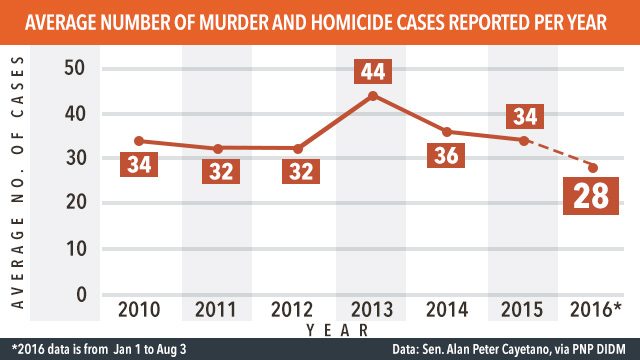
A dashed line may be used to show that the data for 2016 is not yet complete, or is a projection pending the complete data for the year. Additional notes on the graph, like an asterisk, could also be supplied.
The graph also shows a gradual, not drastic, decrease in the average number of cases.
2. If Cayetano insists on plotting the data for July 1 to August 3, 2016, it would be best to go by weekly or monthly figures over time, which is what PNP chief Dela Rosa did in his line graph (shown above). Doing so allows for complete comparisons over a period of time.
3. If the total number of cases will be plotted, he could likewise plot the data for 2016 in just one marker, since the graph started on a per-year comparison. Again, the line between 2015 and 2016 is dashed, to denote an ongoing count for 2016.

4. For a more accurate comparison, the 2016 marker can show data from January 1 to August 3, and compare it to data (if they are available) from the same time period in past years – also from January 1 to August 3 of every year starting 2010.
Another suggestion is to go by the data for every half-year – that is from January to June 2010 onwards to January to June 2016. This way, data sets for all years will be complete.
One final observation: labels for the x-axis (horizontal axis) and the y-axis (vertical axis) would also be of great help in understanding the graph better. Both Cayetano’s and the PNP’s graphs don’t have them.
It should be noted that there had been numerous changes in methodology in reporting crime statistics to PNP headquarters in Camp Crame. Data from 2013, for instance, included barangay blotters and reports from other law-enforcement agencies, accounting for the spike in reported cases.
In mid-2014, the PNP introduced “Oplan Lambat-Sibat” that included an audit of crime reports submitted to Camp Crame.
Graphs and charts help us make sense of the world by converting rows of data into simple, visual images. Incorrect presentations can mislead and misinform.
These visuals display patterns in the data and serve as basis of leaders, policy-makers, and the public to arrive at accurate conclusions and decisions. It is therefore important to handle data with great care and present graphs accurately. – Rappler.com
Add a comment
How does this make you feel?
There are no comments yet. Add your comment to start the conversation.