SUMMARY
This is AI generated summarization, which may have errors. For context, always refer to the full article.
Google’s Android mobile operating system is getting a major facelift.
At its annual I/O developer’s conference, Google debuted Material You, a new design language for the firm’s products and ecosystems to help realize its new vision of making technology simple, accessible, and more personal. And Android is one of the first to be benefitting from some changes.
Senior director of Android Sebastian Bauer said in a media session that, when working on the mobile OS, they always want to serve different use-cases and form-factors of personal devices.
However, Google’s existing Material Design was not cutting it anymore, and that they had to break out of what he described as a “rigid system” to stay in line with the firm’s new vision.
Out of that need for a new design came all the changes and features that are coming with the rollout of Android 12.
Bauer said the goal was to design an interface that feels more “human,” by which he meant that accessibility, usability, and all these other experiences were inherent to the design itself rather than something they had to design for.
As such, the approach was to make the interface feel adaptive in the sense that it’s aware of your ever-changing needs as a user and responds accordingly to them.
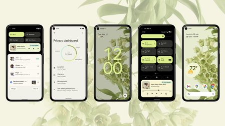
For example, the addition of customized color palettes for the overall design is adaptive to your personal taste and style. The interface is able to accommodate different color-based moods beyond the typical dark and light modes, letting you play around with how you want your interface to look.
Another good example of this design approach at work is in the overhauled Always On Display, where the clock appears larger when there are no notifications. This lets you know whether you’re caught up from just a quick glance. It communicates information without having you open your device, which in a way makes your device feel alive.
What’s more, you can change the size, line width, contrast, and other visual characteristics of the interface’s elements to fit your own preference. And with the new design being built to adapt to different screen sizes and devices, it’s able to carry your settings from surface to another.
That includes legacy devices, with Android 12 working retroactively from the Pixel 3 and up.
The overall design, animations, and a number of other features will extend to the Android devices of partner manufacturers as well. Google will provide guidelines and support to help partners incorporate these new elements into their own versions of Android.
Bauer noted that this redesign is not a one-and-done release, it will actually serve as the foundation for which they scale the mobile operating system moving forward.
Google has yet to reveal when it plans to commercially roll out Android 12. But the update is live now for those who are lucky enough to have been selected for the beta tests. – Rappler.com
Add a comment
How does this make you feel?
There are no comments yet. Add your comment to start the conversation.