SUMMARY
This is AI generated summarization, which may have errors. For context, always refer to the full article.
![[ANALYSIS] Have we flattened the curve?](https://www.rappler.com/tachyon/r3-assets/5BC38BADAE464AE18BD67C6B3030742D/img/EBA22C4DDF6D4FEEA1A2FB174A790649/MORE-EVIDENCE-LESS-FORECASTS-covid-19-TL-640.jpg)
 Never before has the need for evidenced-based decision-making been greater than today. The stakes are high. The economy has been pushed into recession. Lives and livelihoods are at risk.
Forecasts are not evidence. They must be held against the unfolding reality. But they have their uses too. Forecasts may have been useful at the start of the COVID-19 pandemic when much about the disease was unknown.
Four months after the first outbreak in Wuhan, China, the world knows better. We now have a fairly good grasp of the nature of the disease, the risk posed to public health, and the part of the population most vulnerable to it, thanks to evidence accumulated around the world during this period. Policymakers should be turning to this body of evidence rather than relying on speculative forecasts that are often based on unproven assumptions.
On its part, the Department of Health (DOH) has been compiling detailed information on confirmed cases of infection, utilization of hospital facilities, availability of personal protection equipment (PPEs), and tests processed by accredited laboratories. Presumably, the data is intended to inform the public and to guide policymakers.
Improving data quality
Data quality is key. But also the data must be examined and analyzed, conclusions debated and results judiciously used to inform policies and decisions.
Collecting accurate and reliable data in normal times is difficult enough. Doing so in the course of a pandemic is doubly difficult. Efforts must be made to improve data quality. Otherwise, data gaps and discrepancies undermine the credibility of government decisions, of critical importance during the pandemic. Inadequately addressed, these can lead to suspicions of authorities massaging the data to suit their inclinations.
Take the data on COVID-19 related deaths. Along with new cases and recoveries, the DOH reports the number of new deaths every day. Not all new deaths announced on a given day happened in the last 24 hours. Most reported deaths occurred days, weeks, even a month ago. Many do not indicate the date of death. In more than a few cases, there is no information on the city, municipality or province where the death occurred.
Depending on which date is used, deaths by date reported or date died, one gets opposite trends during two critical periods in the previous month – the run-up to April 15 and April 30 as the government decided on a course of action. The graph below makes this point clear.
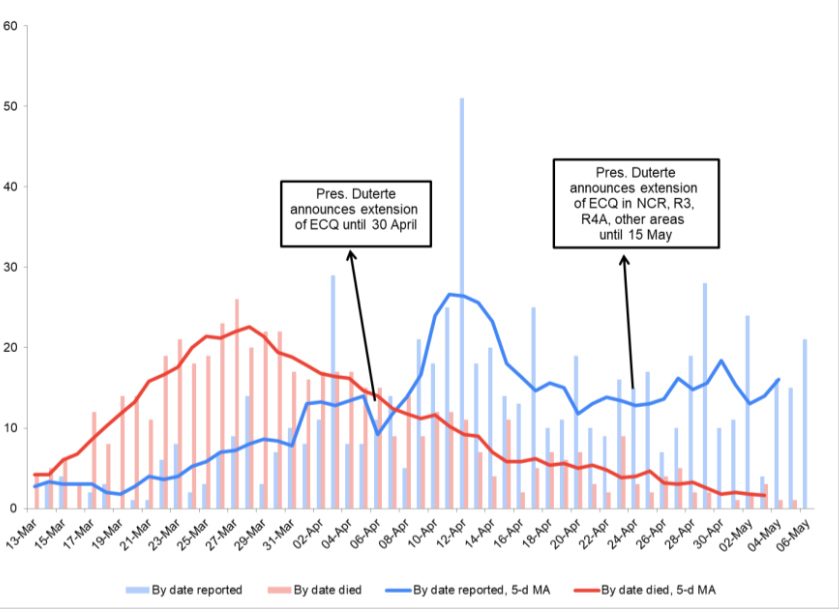
(The bars show daily deaths by date reported (blue) and by date died (red). The lines show the 5-day moving average (MA) of each data series. The MA is the average of the value on that day, and two days before and after.)
Based on date of reporting (blue line), reported deaths accelerate in the second week of April, following a short dip the previous week. They rise again, albeit less steeply, towards the end of the month.
Pandemic behind us?
A different picture emerges if we use daily deaths based on date of death (red line). Deaths rose steeply from mid- to end-March, levelled-off for a few days, and have been declining since. By early May, daily deaths were below levels seen when the lockdown began. The sustained downtrend in deaths based on actual date of death is perhaps the clearest sign yet that the pandemic has considerably weakened.
The gap between these two trends is due to delays in reporting and undated deaths. The latter were when reckoning the trend based on date of death as there is no basis for distributing the observations across time. Simply assuming these deaths happened within 24 hours of reporting does not change the overall downward trajectory since the end of March.
Note that death lags infection by 3-9 weeks, including 5-6 days incubation period, according to the World Health Organization (WHO), which implies that infection peaked somewhere around mid February (a month before the March 15 lockdown, but that is another story). Going by the falling number of deaths, we can infer that infections have significantly slowed.
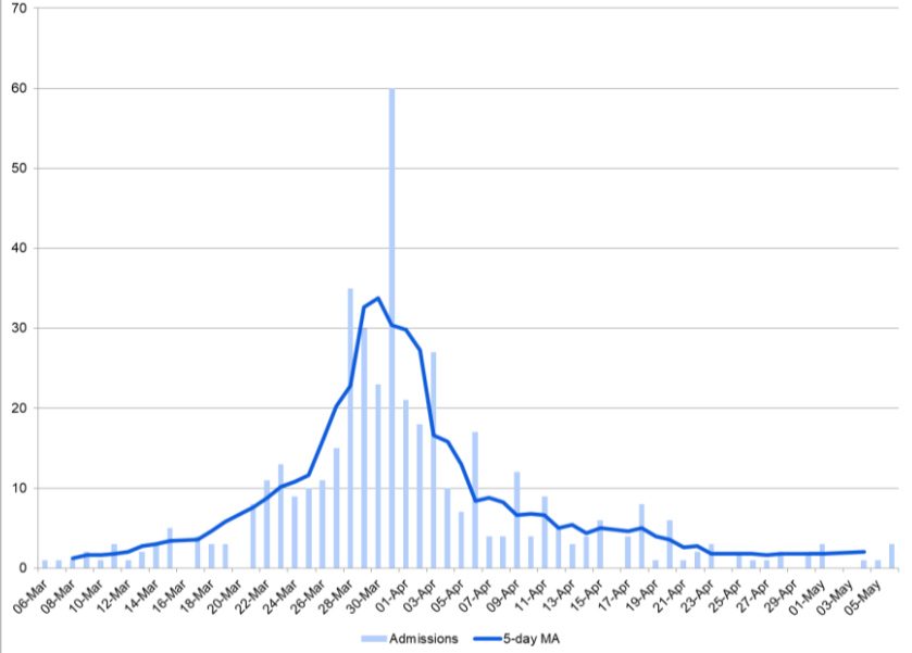
The data on daily hospital admissions of COVID-19 patients point to the same conclusion. This data is based on the date of confirmation of a positive result, not the date of admission.
That information is not in the dataset, which would have made the data more meaningful. Using the date of admission basically flattens the curve to the left, confirming our previous conclusion that the curve was flattened long ago.
In sum, the DOH data on deaths and hospital admissions provide preliminary evidence that the pandemic is behind us. We have flattened the curve. More and weightier evidence will be needed to convince the government to change course and the public to change its mind on the real threat posed by COVID-19.
Moving forward, we need evidence-based policies to manage residual risks and repair the damage to the economy while avoiding even greater disasters.
To deliver that, policymakers must begin taking a hard look at the evidence. – Rappler.com
Clarence Pascual is a consulting economist with a master’s degree from the UP School of Economics. He has worked with NGOs, and was former director at the Governance Commission for GOCCs and assistant secretary at the Housing and Urban Development Coordinating Council.
Add a comment
How does this make you feel?
There are no comments yet. Add your comment to start the conversation.