SUMMARY
This is AI generated summarization, which may have errors. For context, always refer to the full article.

We are reposting with permission this blog post by data science company Thinking Machines.
MANILA, Philippines – Imagine you’re the Metropolitan Manila Development Authority (MMDA), and you’re facing a gargantuan challenge of fixing traffic congestion in Metro Manila. What’s the smartest, most efficient way to use your limited resources and manpower to make the biggest impact?
This is exactly what the MMDA is currently trying to use data to figure out. Since October 2016, our team has been working with the MMDA to use Waze data to better understand and address Metro Manila’s transport woes.
Before hooking up with Waze, the MMDA could only measure traffic by manually counting vehicles on the road, eyeballing CCTV videos, or literally sitting in traffic on EDSA to measure travel time. With Waze, the MMDA now has access to millions of crowdsourced, real-time data points collected from almost every nook and cranny of Manila’s roads.
MMDA traffic experts can use this data to craft policies that can help alleviate traffic at crucial choke points. They can also evaluate the impact of policies by checking pre- and post-travel speed data on the roads where these policies are implemented. Hooray for A/B testing in real life!
The potential of using Waze data to push data-driven traffic policies is immense, and we’re deeply excited and honored to be helping our government push for this vision! In this blog post, we’re going to demonstrate how Waze data can be used to identify traffic choke points on a single road for a single direction.
But, take this analysis with a grain of salt – when it comes to solving real world problems, data analysis is just the beginning. It’s ultimately up to organizations like the MMDA to combine data-driven analysis with on-the-ground verification and problem-solving action.
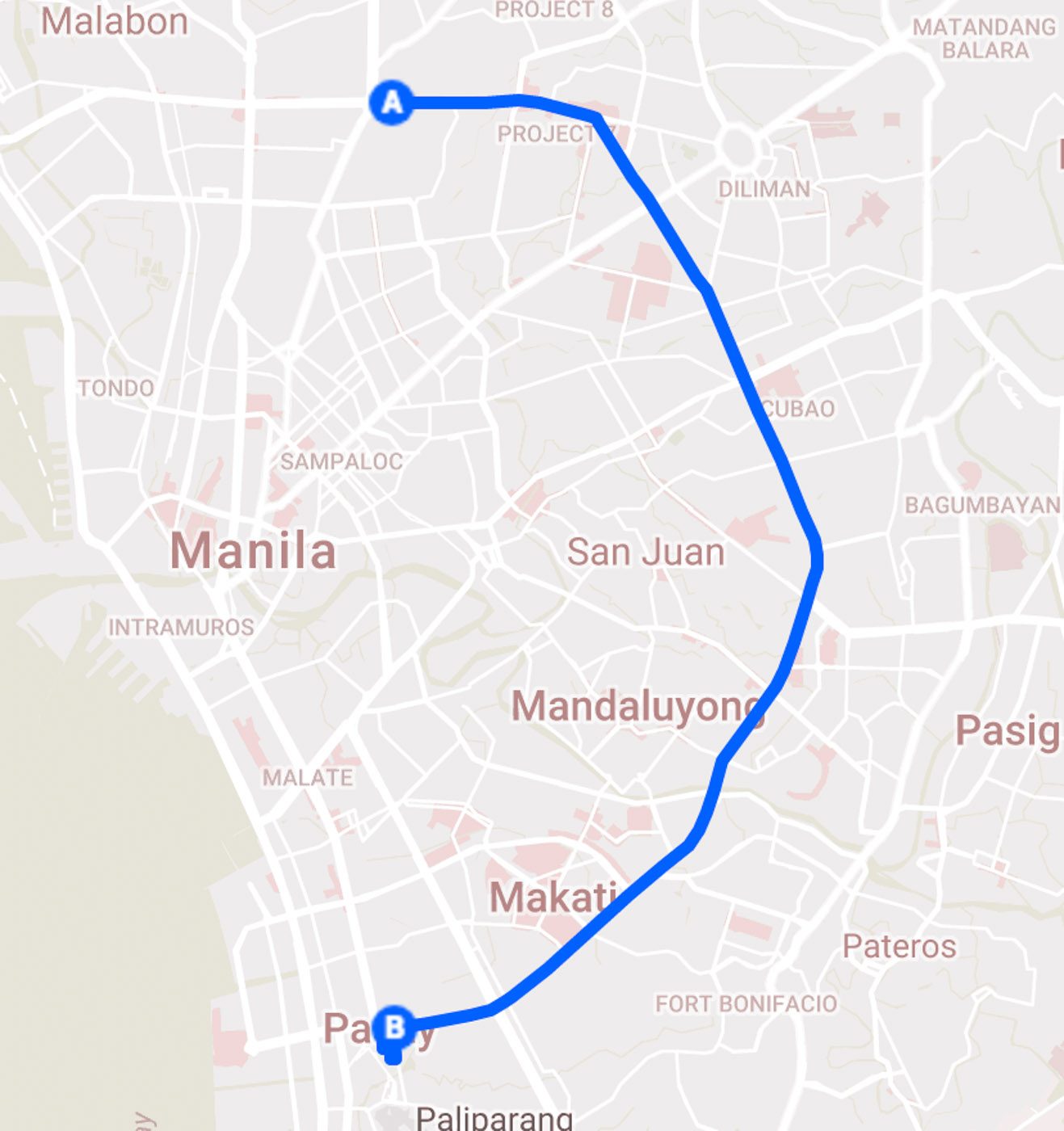
For this demo analysis, we’ll focus on EDSA Southbound, a corridor that almost everyone in Metro Manila uses. We’re using average speeds gathered from Waze roughly every 5 minutes between March 11 to April 3, 2017. [See our data source section below for details and limitations.]
Wait, what’s a choke point?
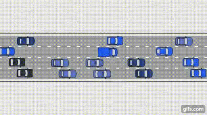
Have you ever been stuck in snail-pace traffic for hours, only to find out that a single stalled car on the road was to blame for your wasted time? That’s a choke point – a bit of the road where the travel speed slows way down before gradually speeding up again.
While some choke points are temporary, others are chronic. These might be caused by badly-paved roads, an open manhole, a misplaced traffic sign, or other persistent obstructions.
To identify parts of EDSA Southbound that consistently demonstrate this behavior, we used the following logic:
1. Plot the speeds over the road segments, relative to their road length. (For the examples below, we used the cumulative road length as the x-axis and speed for the y-axis.)
2. Visually, look for the points along the road where there is a consistent drastic drop in speed. Usually, this is followed by gradually speed recovery (i.e., gradual increase in speed) over time.
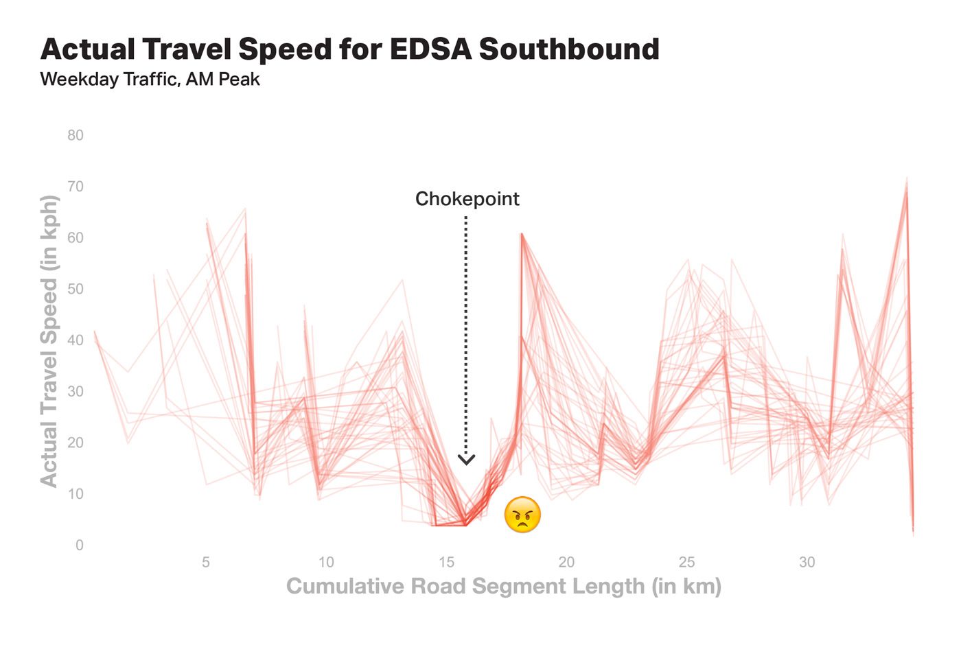
Let’s use the chart below to help us spot patterns. Imagine that each red line represents travel speeds across EDSA Southbound during a single 5-minute snapshot in time. The higher the line, the faster the speed at that particular moment and section of EDSA. Over several weeks, you’ll end up with hundreds of these lines layered on top of one another. Choke points are spots where the red lines consistently dip:
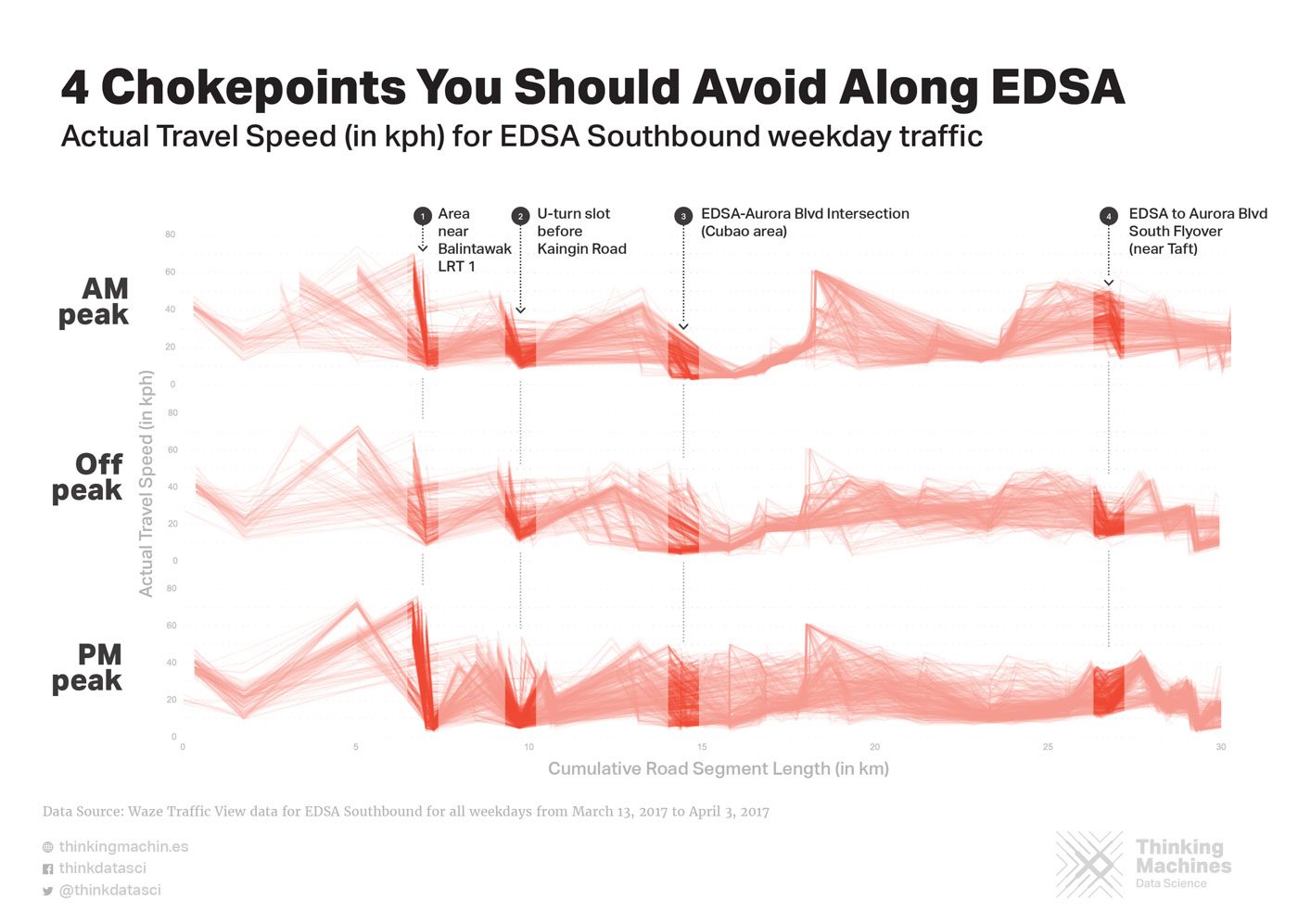
It makes more sense to chunk together speeds recorded during similar times of day and days of week, so we cut the data into 3 peak windows: morning peak (7-9 am), off peak (12-2 pm), and afternoon peak (4-7 pm). Given these parameters, we can still spot 4 consistent choke points on EDSA that you’re likely to encounter at almost any time of day:
What could be causing traffic to build up in these areas? While the MMDA is currently investigating these spots, we can use the power of Google Maps to remotely check the selected areas. Let’s go through each one.
Potential chokepoint 1: Area near Balintawak LRT1
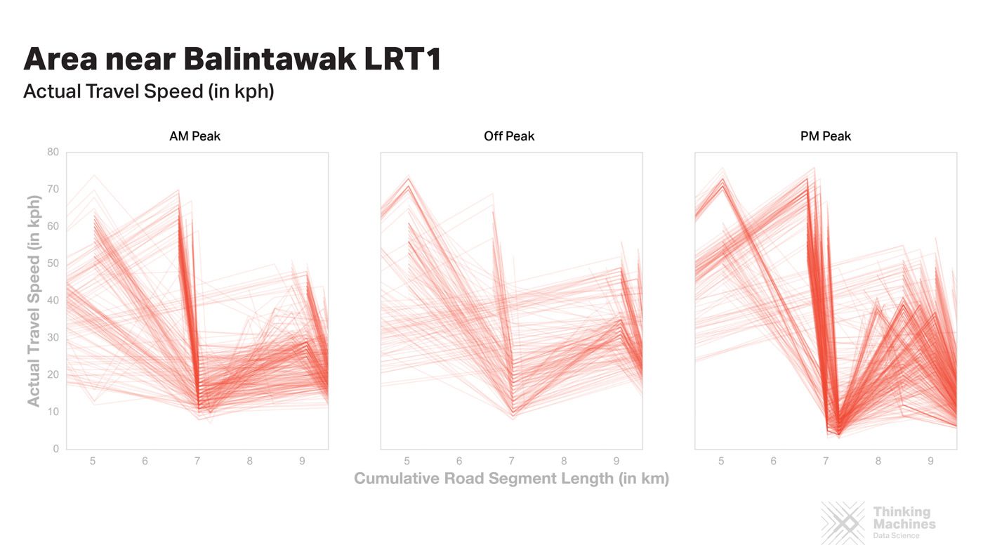
The first chokepoint is an area near Balintawak bus terminal and Balintawak LRT 1. Looking at Google Maps images, we can guess some possible causes of traffic in this area. First, there’s a bunch of parked cars and tricycles occupying a third of the road!
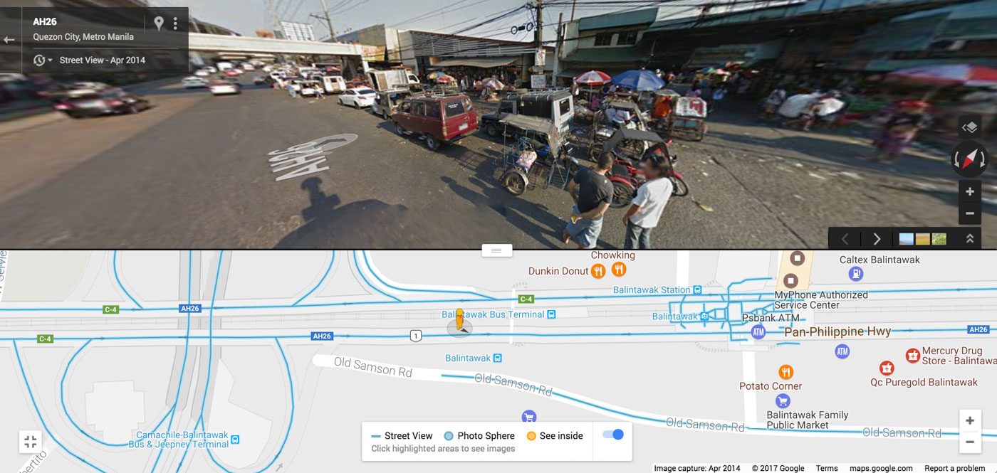
The area is also near the Balintawak Bus Terminal and the LRT station – both of which have a lot of pedestrians departing or in line, which also occupies a third of the road.

Potential chokepoint 2: U-turn slot before Kaingin Road
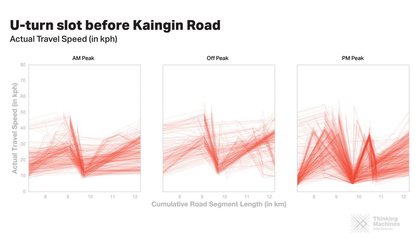
From this Google Maps image, we can see some traffic building up along the U-turn slot that’s occupying two lanes.
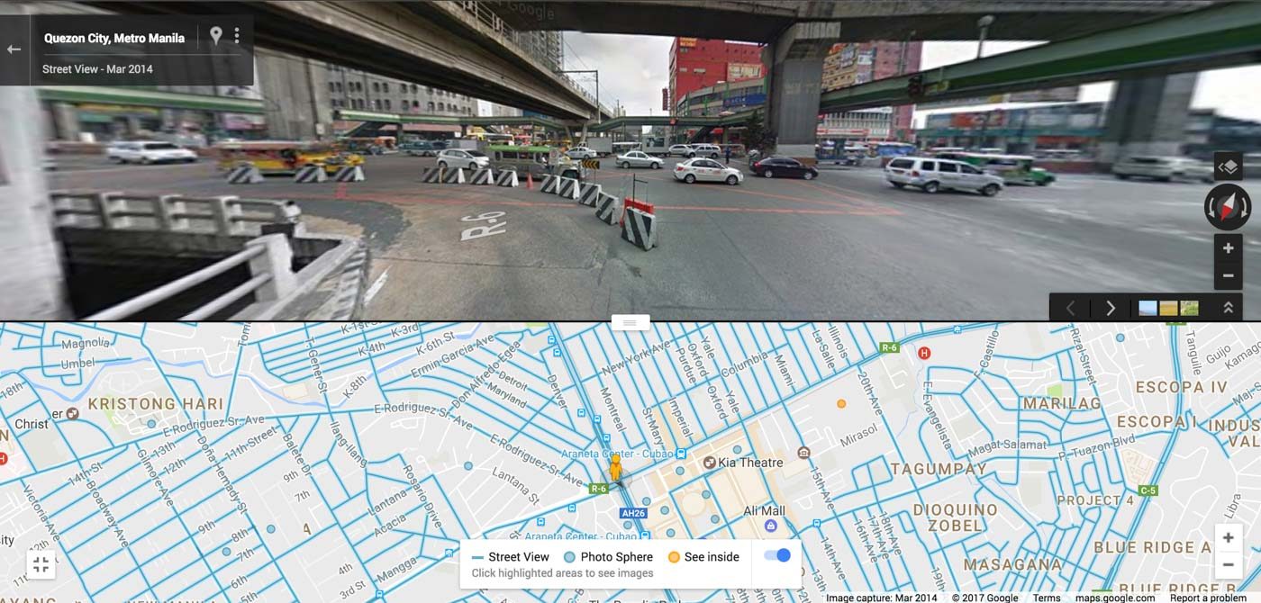
Potential chokepoint 3: EDSA-Aurora Blvd intersection (Cubao area)
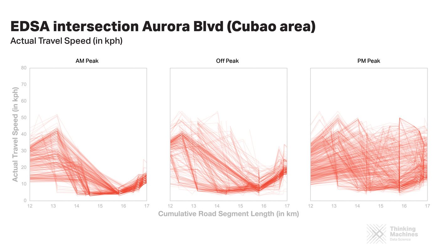
This is the slowest choke point and perhaps the most infamous. The dip for this chokepoint is more pronounced for the AM peak, which isn’t surprising since it’s the intersection of two major roads which are traversed by a lot of cars.
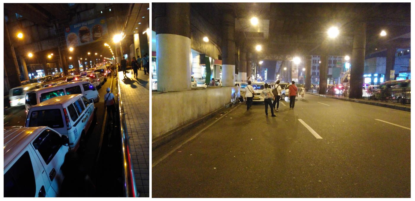
This is a major commuting node for Metro Manila, which attracts crowds of commuters, jeepneys, PUVs, and buses especially for the weekday rush hours. Even at night, this intersection still experiences moderate traffic caused by parked PUVs (see left photo below) and lines of pedestrians (see right photo below) who have nowhere else to flag down vehicles and sometimes spill over onto the street.
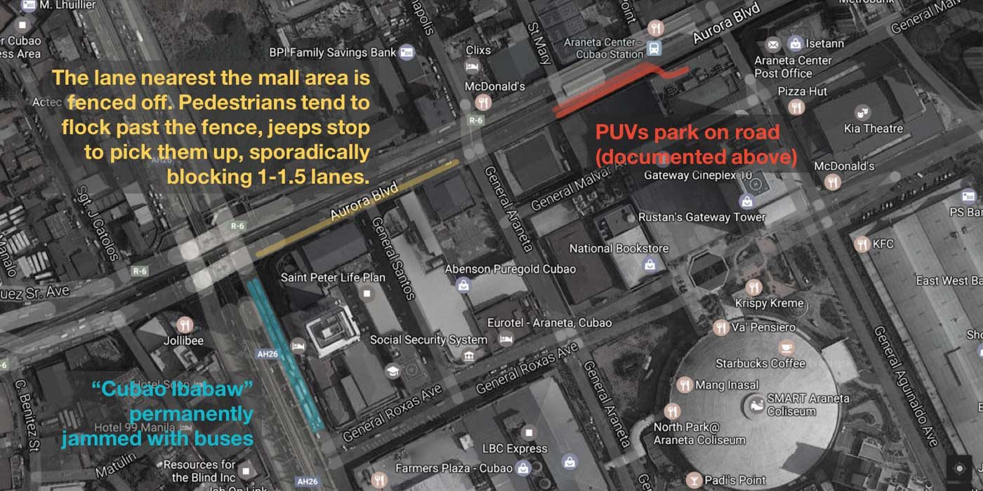
For a bird’s eye view of this intersection, see below for a map with annotations of other possible causes of traffic in this area.
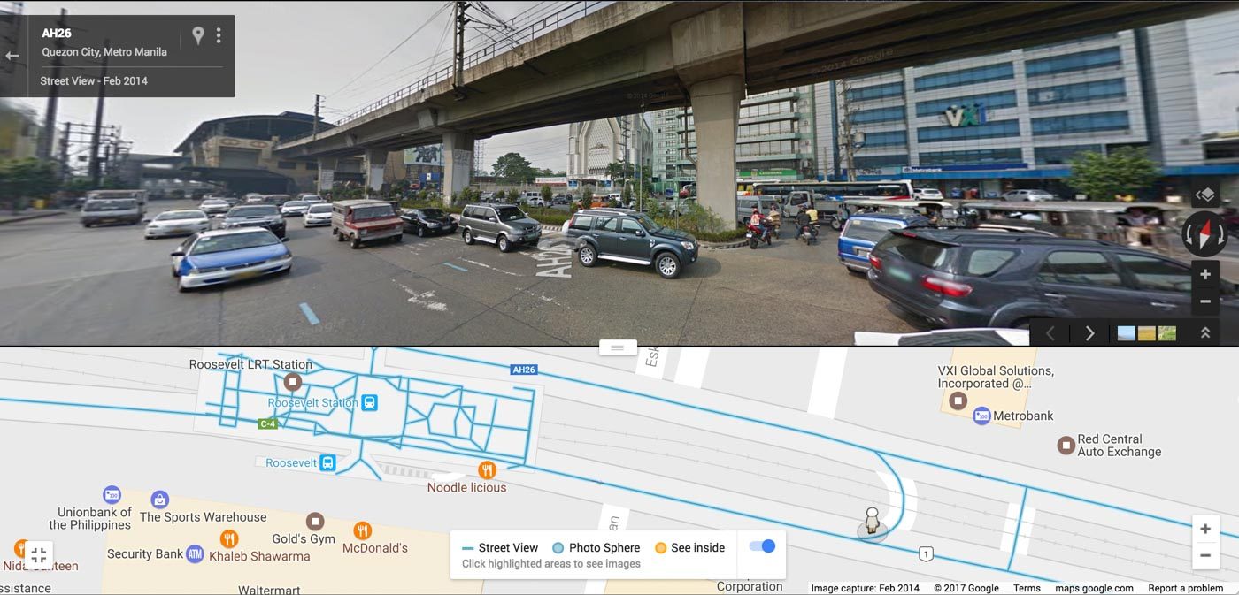
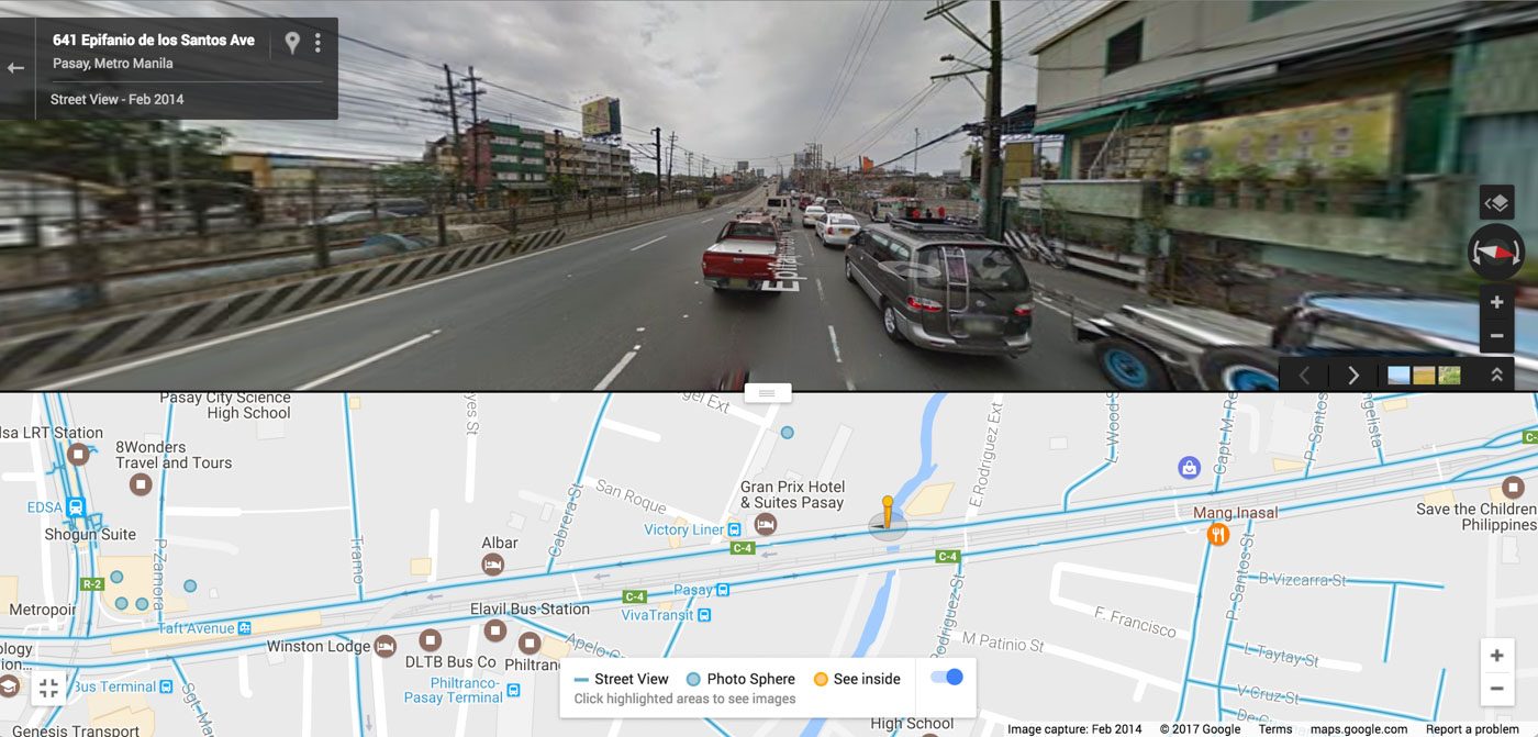
Potential chokepoint 4: EDSA to Aurora Blvd S Flyover (near Taft Ave)
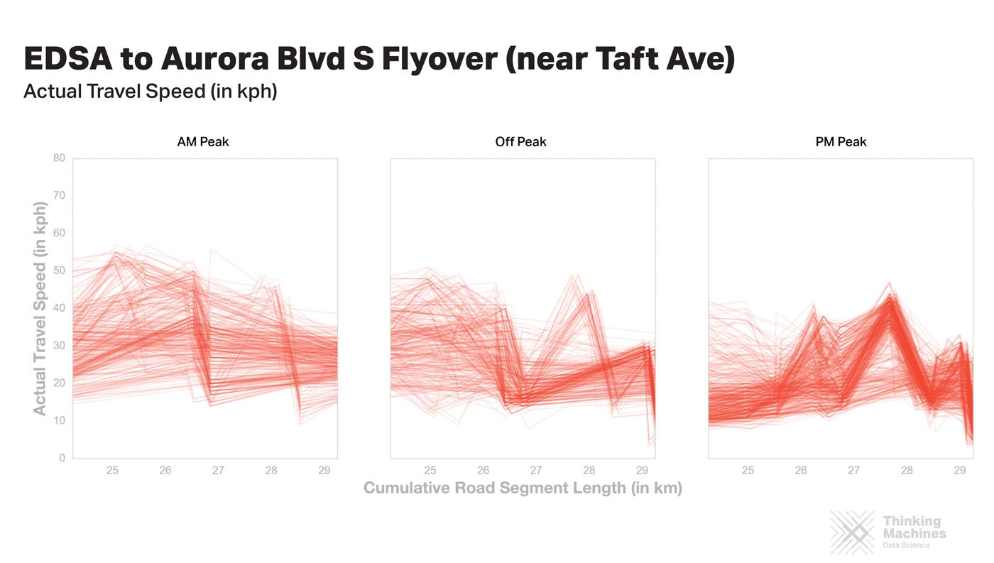
Another intersection for two major roads, but not as bad as the first one. Could cars swerving left to take the flyover be the reason for slowdowns here?
When analyzing data, it’s always smart to corroborate your results with information you already know. So how does this data match up with the MMDA’s on-the-ground knowledge? Pretty well!
These choke points were among 6 EDSA problem areas that the MMDA already identified back in 2015. This gives us more confidence to use the same method to find choke points on streets where the MMDA might not have eyes and ears.
Did you notice anything interesting in the charts that we didn’t see, or have you experienced any choke points aside from the 4 potential leads we listed? Feel free to send us an FB message or a tweet to share your traffic chokepoint experiences along EDSA!
Data source details and limitations
Our data source is the Waze Traffic View, a special web portal that media organizations and government agencies in the Waze Connected Citizens Program can use to monitor traffic updates and average speeds on select roads in their respective cities. Traffic view provides real-time travel speed data on user-defined monitored roads every 5 minutes.
The portal also divides each monitored road into segments (based on its traffic congestion level) and provides real-time travel speed data for each segment. However, the road segmentation is not consistently done by Waze Traffic View. To compensate for the lack of consistency, we connected the available segment-level speed data with lines, which implicitly does linear interpolation for data gaps.
One caveat regarding the precision of Waze Traffic View data: road segment length (in km) is stored up to two decimal places, so rounding errors may affect the precision of plotted points in the charts above. After removing outliers due to data collection quirks, total road length (in km) for EDSA Southbound varies from 34.25 to 34.45. (Total road length is computed by getting the sum of all road segments as collected by Traffic View.)
Because these plots use data from March 11 to April 3, 2017 only, so these are not representative of the general patterns of EDSA Southbound across all months. The analysis also doesn’t consider the influence of external events such as the light truck regulation along EDSA which started last March 15, or changes in traffic caused by the rainy season or school start/end dates.
Ideally, we’d advise the MMDA and Department of Transportation to capture more of this data over a longer window of time and merge it with other transit data sources, such as the World Bank’s OpenTraffic Initiative. – Rappler.com
If you want to learn how to tell data stories the Thinking Machines way, it is holding a workshop on May 3, 2017. So hurry up and register before slots run out!

Add a comment
How does this make you feel?
There are no comments yet. Add your comment to start the conversation.