SUMMARY
This is AI generated summarization, which may have errors. For context, always refer to the full article.
MANILA, Philippines –– The Philippine Amusement Gaming Corporation (Pagcor) is facing a firestorm of criticism online after it has drastically changed its logo for P3 million.
From the familiar logo depicting green hands holding light, Pagcor’s new logo resembles flames to supposedly symbolize the agency igniting change and progress. Chief executive officer Alejandro Tengco added that the change depicts its “re-energized” role as the country’s gaming regulator.
“The logo likewise reflects a beacon which symbolizes guidance, leadership, and direction. It represents a guiding light that helps people find their way,” Tengco added.
The logo and the amount spent for it was questioned by several graphic designers.

Pagcor tapped Francisco “Dopy” Doplon of Printplus Graphics Services, according to the notice of award posted on its website.
The document showed that the logo redesign was worth over P3 million. Documents from the Philippine Government Electronic Procurement System that Pagcor recommended a negotiated procurement arrangement for Printplus to design the logo.
“As per our online checking, Mr. Doplon is the past president of the Design Agencies Association of the Philippines. He is an acclaimed graphic designer with premier works for Cultural Center of the Philippines 40th Anniversary Logo, University of Santo Tomas’ 400 years Tongues of Fire Logo, Metrobank Foundation and All Day Supermarket logos among others,” the document read.
Rappler has reached out to Doplon to ask about the design process, but he declined to comment without Pagcor’s approval since he is under contract with the agency. Rappler has sought comment from Pagcor regarding the matter.
Previous projects, achievements
This is not Doplon’s first time in creating logos for government agencies and corporations.
According to a Vera Files article in 2009, Doplon was the one who redesigned the logo of the Cultural Center of the Philippines. He drew inspiration from the old CCP logo and added a wave breaking into the shore and 40 small pebbles representing the 40 years of the CCP.
In 2011, Doplon won the logo-making contest of the University of Santo Tomas and his design was used for the quadricentennial celebration.
Doplon, who is a UST graduate himself, called his design “Tongues of fire,” which featured the university’s main building tower. Above it are four flames that spell out “UST” which also symbolizes the 400 years of existence of the university.
“I tried to make it simple but captivating at the same time,” Doplon said in an interview with The Varsitarian in 2008.
“As you see, I chose the colors orange and yellow as they look cool and capture the tastes of the present.”
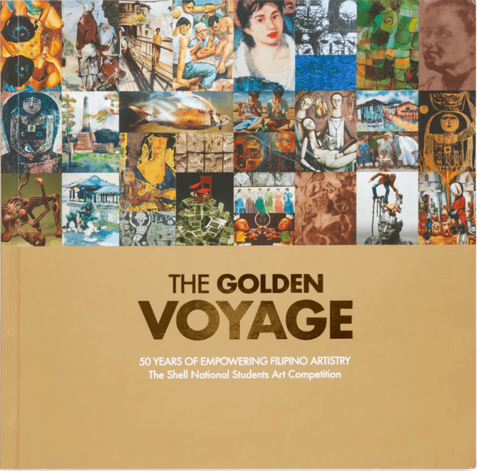
Doplon is also a known book cover designer. In a Manila Bulletin article published in 2021, Doplon was cited as the designer of The Golden Voyage: 50 Years of Empowering Filipino Artistry, an art book which features entries of the Shell National Students Art Competition.
He also designed a coffee table book for tycoon Manny Pangilinan, as seen in an article by BusinessWorld in July 2021.
Doplon told The Varsitarian that he has won two Manila Critics Circle National Book awards for designing the book covers of Homage by Jaime Zobel in 1996, and Silence by Arturo Luz in 2002.
On his personal website, Doplon said that he redesigned the logo of the Philippine Philharmonic Orchestra, Filipinas Heritage Library, and the Tanghalang Pilipino.
He also had several projects with the Ayala Group, having designed the covers of several annual reports.
Doplon has also served as design consultant for United Laboratories and Nestle Corporation.
Doplon listed 25 awards and citations on his website.
He is currently the chief executive officer and creative director of ArtOne Design, a graphics design company specializing in print designs. It has been operating since 1991, according to Doplon’s website. –Rappler.com
Add a comment
How does this make you feel?
![[In This Economy] Marcos’ POGO ban is popular, but will it work?](https://www.rappler.com/tachyon/2024/07/thought-leaders-marcos-pogo-ban.jpg?resize=257%2C257&crop=255px%2C0px%2C720px%2C720px)

![[Vantage Point] China’s silent invasion of the Philippines](https://www.rappler.com/tachyon/2024/07/TL-china-silent-invasion-july-16-2024.jpg?resize=257%2C257&crop=318px%2C0px%2C720px%2C720px)

![[EDITORIAL] Ang ‘deep, deadly web’ ng POGOs](https://www.rappler.com/tachyon/2024/07/animated-pogos-chinese-crime-syndicate-carousel.jpg?resize=257%2C257&crop=280px%2C0px%2C720px%2C720px)
There are no comments yet. Add your comment to start the conversation.