SUMMARY
This is AI generated summarization, which may have errors. For context, always refer to the full article.

MANILA, Philippines – On Tuesday, July 11, the Philippine Amusement and Gaming Corporation (Pagcor) celebrated its 40th year anniversary at the Marriott Hotel Manila, looking back at its achievements since its creation in 1983.
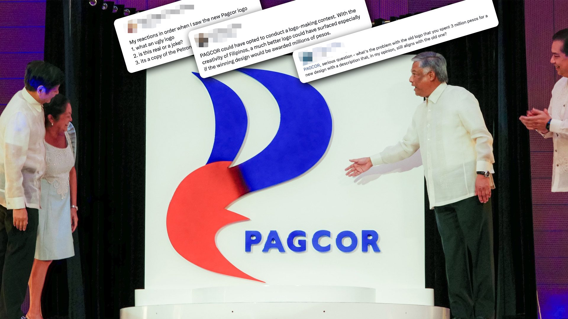
Pagcor chief executive officer Alejandro Tengco, together with President Ferdinand Marcos Jr., First Lady Liza Araneta-Marcos, and House Speaker Martin Romualdez, unveiled the corporation’s new logo.
“Our new logo reflects Pagcor’s long-standing commitment of being a guiding force that illuminates the way forward, drives transformation and development, and brings inspiration and motivation to the lives it touches,” Tengco said.
The night could’ve ended at that – a commemoration of the state-run corporation’s role as one of the government’s biggest revenue generators. But netizens quickly took a jab at the event’s centerpiece: the new logo that was worth P3 million.
Redesigning a redesign
With the Department of Tourism’s (DOT) ‘Love the Philippines’ fiasco still fresh in everyone’s mind, several digital creators took the opportunity to share what they could have done to improve Pagcor’s logo and explained their design philosophies.
RGB Designs said the rationale of the logo was fine, but the execution was just “way off.”
Designer Ben Macarilay posted his suggestions, noting that Pagcor’s old logo could serve as an inspiration for the new one.
“In the process of re-spinning the logo, all the elements have been derived from the original design to preserve the corporation’s identity,” he said in a Facebook post.
Meanwhile, artist Tarantanong Kalbo took a swipe at the new Pagcor logo.
stretching muna bago tumalpak 🙆🏻♂️ pic.twitter.com/8nZehkrYvT
— Tarantadong Kalbo (@KevinKalbo) July 12, 2023
Facebook user Jekjek SA Callos pointed out the jarring gradient transition from blue to red, among other questionable design choices.
Facebook user Nicolo Nimor had this to say about the Pagcor logo – “Vintage feels? Microsoft word vibes? Say no more!”
Other netizens like Facebook user Jubert Sayo Celiz defended the artist behind the logo. He pointed out that at the end of the day, clients will always have the last word on the design they want.
Facebook user Lou Flores also echoed the same sentiment, putting emphasis on the possible fraught relationship between the artist and the client.
“As a logo designer, I had a lot of logo designs [that] I am really not proud of, as a designer, there are studies I wished that got approved instead. [The P3 million] logo fee just sits so right in, for all the efforts and studies the artist rendered here, as long as it wasn’t [a] dummy cost for hidden agenda,” she shared.
Arabella Christianne Quilisadio said that people should refrain from attacking the artist.
Why fix what’s not broken?
Aside from the numerous redesign suggestions, social media users also questioned the rationale behind changing Pagcor’s logo.
“What’s the problem with the old logo that you spent P3 million for a new design with a description that, in my opinion, still aligns with the old one?” Facebook user Roy Van Rivero asked in a post.
For Twitter user @eufems, the old Pagcor logo encapsulated the corporation’s role as a gaming regulator, while the new one could be easily mistaken for the logo of another agency.
Facebook user Ken Cariño stressed that other Filipino graphic designers could deliver an “acceptable, suitable and distinctive design” with a lower budget.
Ugliest logo contest? Twitter user Marky Ramone Go tweeted the logo changes of other government agencies, implying that the old ones were better.
Twitter user Gideon Peña lamented how the corporation could have harnessed Filipino creatives through a logo-making contest.
“With the creativity of Filipinos, a much better logo could have surfaced especially if the winning design would be awarded millions of pesos,” Peña said.
What do you think about Pagcor’s rebranding? – Rappler.com
Add a comment
How does this make you feel?


There are no comments yet. Add your comment to start the conversation.